OkCupid Dashboard
projects | | Links: Dashboard link

data analysis data visualisation
🚩 Goal
Understand the demographics and lifestyles of users on OkCupid (view on kaggle here)
📊 Data
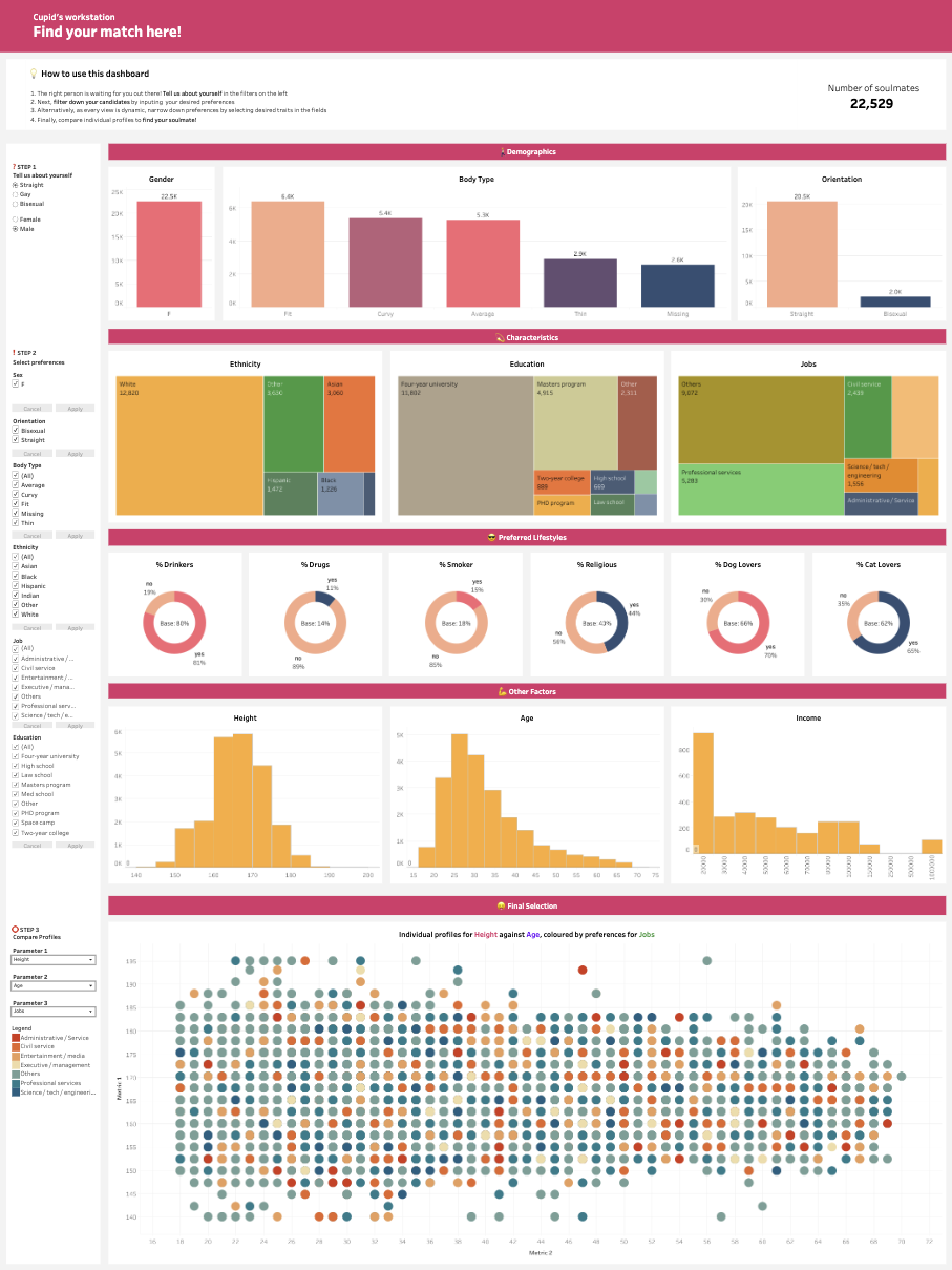
This dashboard ingests data gathered from OkCupid profiles from 2012. Numerical columns were cleaned and grouped into bins to better understand their distribution. Histograms were subsequently generated to visualise these distributions. The original dataset contained several fields which numerous categories. To faciliate visualisation, low frequency categories were combined to present the data in a clearer manner.
🖥️ Dashboard
🔥 Features
The dashboard allows the user to explore the data in the following manner
- Select some basic information about the user, such as their
genderandsexual orientation - Select user preferences, such as desired
ethnicity,education, andprofession - View individual profiles and how they stack up against other users in the curated dataset
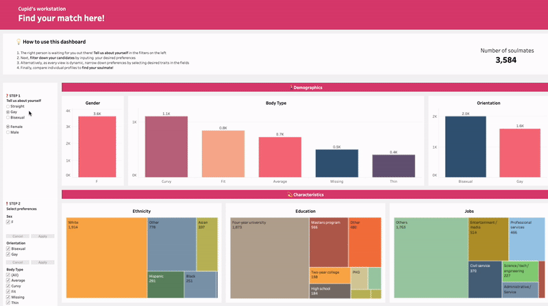
The Tableau dashboards used in this project are dynamic and designed to facilitate exploration of the data in an intuitive manner. In addition to using the filtering options on the left of the dashboard, the user is also able to interactive define their preferences by selecting their desired traits from the treemaps and barcharts in the dashboard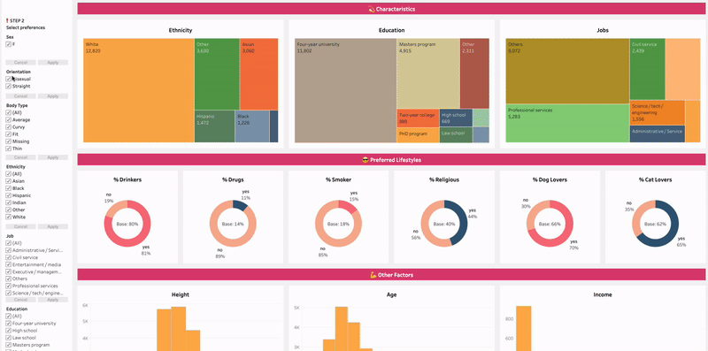
The final view allows the user to view individual profiles from the reduced dataset.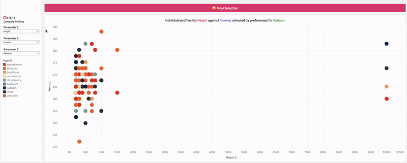
Play around with the dashboard here
Further Reading
[1] A primer about the science of attraction can be found in this video