Simple Linear Regression - A Layman's Guide

Machine learning and statistics have many applications in business and the social sciences. However, the theory is often intimidating and not easily understood. In this series of articles, I aim to demystify the concepts behind the common tools used in data science and machine learning, starting with linear regression.
Overview
Linear regression is a statistical method that allows us to describe relationships between variables (distinct things that can be measured or recorded, such as height, weight, and hair colour). It is an extension of the General Linear Model, a framework to describe how a variable of interest can be modelled using other predictor variables.
Data = Model + Error
In simple linear regression (SLR), we focus on the relationship between two continuous variables, x and y (hence, simple).
There are many interchangeable terms for x and y: y can be referred to as the response, dependent, outcome, or target, while x can be referred to as the predictor, independent, explanatory, or feature.
For the sake of consistency, I will refer to x and y as the independent and dependent variable respectively. One useful way to remember which is the dependent is to think about the dependent y as “depending” on the independent x, while x is not affected by y and thus “independent”. For example, we could hypothesize that exam results are dependent on the amount of time spent studying (note that the relationship does not work the other way round).
Case Study: Exams
Our earlier hypothesis seems to intuitively make sense; in order to test for the presence of this relationship in the real world, we can gather some data and attempt to model this phenomenon using SLR.
In general, SLR is a useful starting point if you have two continuous variables and you wish to find out if they have any association with each other.
Before running any sort of model, it is good to plot your data to visually check your data for any outliers and trends. Using a sample dataset of 15 students, we can use a scatterplot to represent our data visually.
Even without SLR, we can identify a trend that appears linear and positive: based on our sample dataset, it would seem that students who studied more were likely to do better. Note that in the plot, I have set y = exam results and x = study time. It is conventional to plot the dependent variable on the y axis.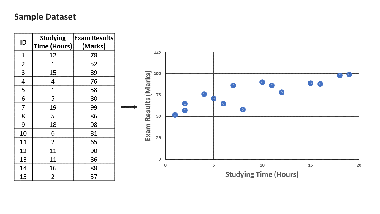
As the relationship between exams and study time appears linear, SLR is a good candidate. If the scatter plot reveals a relationship that does not appear to be linear, we can consider using non-linear models or transforming the variables.
Model Breakdown
We can express a simple linear regression using the following equation: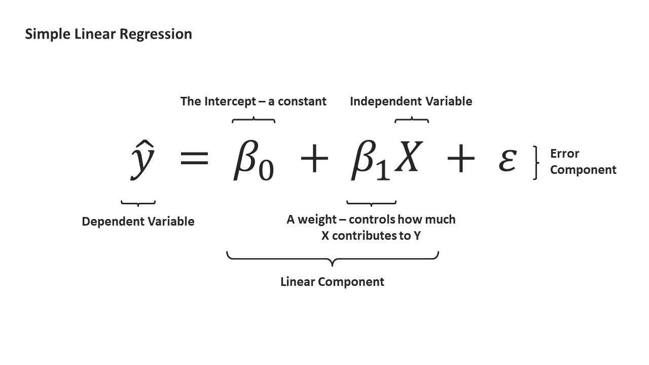
Let’s break down this equation from left to right.
Our dependent y is what are interested in estimating. We put a hat on the y because we are making an educated guess of y from the data available to us (in statistics speak, we are estimating the population mean from a sample).
Those weird-looking βs in the equation? Those are called betas. The intuition behind βs can be explained using our case study of the effect of exam results and study time. Remember that the goal of SLR is to quantify the relationship between two variables. We might reason that students who put in more hours nose-deep in their books tend to do better for their exams, but by how much? β_1 essentially answers that question: the larger in magnitude, the stronger of an association between x and y.
When x is 0, β_1 multiplied by x results in 0, so β_0 describes a baseline expectation. In our case study, β_0 describes how much one should expect to score given one does not study at all.
Given β_0 and β_1, we can plot a line that intercepts the y-axis at β_0 and has a slope of β_1.
The line (represented in green below) is the visual representation of our model of exam results against hours studied, computed as
Exam Results = 57.46 + 2.18 x Hours Studied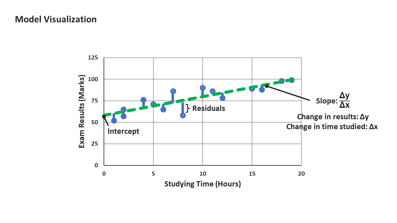
Finally, we arrive at our error component (ε) in our SLR equation. It is important to note that the data points do not sit exactly on the line. This is unsurprising when dealing with real-world data: not everyone who studies 10 hours for the exam will score the same mark. There might be other factors, such as individual ability to retain information or hours of rest the night before, that could play a part in ultimately determining exam results.
These considerations, which are not captured in our linear component, form part of our ε, which also includes other random or unexplained variations and measurement errors.
ε = Measurement Error + Omitted Variables + Random Variation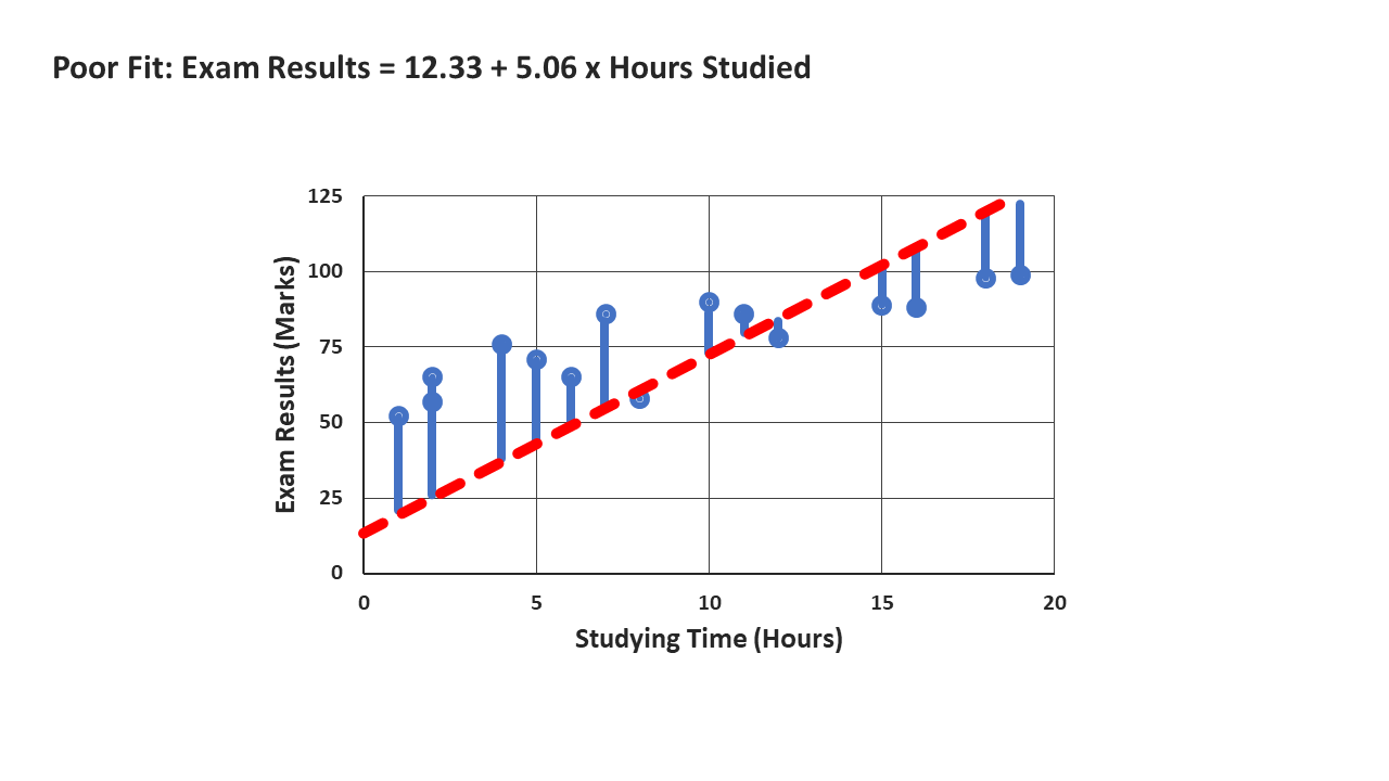
Ordinary Least Squares
To recap, we have the values for our y (exam results) and x (study time). Given our data, we estimate the values of β_0 and β_1. How do we select “ideal” values? We want βs that minimize the residual sum of squares (RSS). We can calculate the RSS of our model using the following equation:
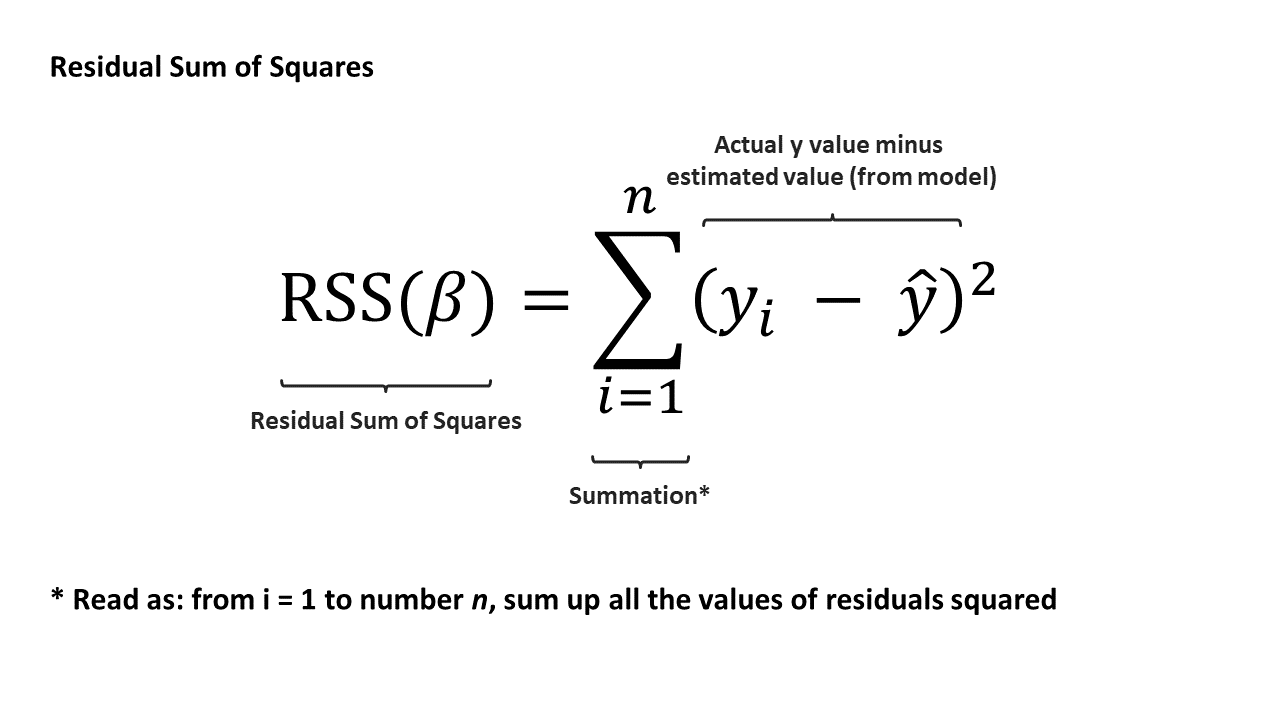
Terminology time — this method of fitting the model is known as ordinary least squares (or OLS). Under certain assumptions, OLS will provide the best possible estimates for SLR. A model fit using this method is also known as the line of best fit.
There is also a convenient solution to find the best β estimates from OLS using linear algebra: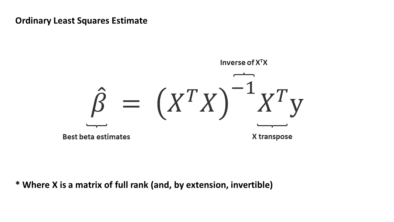
With the widespread availability of statistical software, we do not usually calculate βs manually.
Interpreting Model Results
Recall that SLR adheres to the frame of the General Linear Model. Where
Data = Model + Error
As the variation in the data can be broadly split into variation “explained” by the model and unexplained variation, we can quantify our model strength using a statistic called the R².
The R² is a goodness of fit measure — it is a measure of how well the predictions using our independent variables fit our real-world data. The R² typically ranges from 0 to 1, with 1 indicating that the predictions from our model perfectly explain all variation in the data. Conversely, having a low R² indicates that a model might have more unexplained variation, leading to wider confidence intervals and more uncertainty in our predictions.
The R² is often used and reported to validate our model’s “strength” as it quantifies how much better a model is compared to a baseline “model” (estimating values using the mean of our dependent y). Nevertheless, goodness of fit measures are only one way of validating our model — a high R² does not automatically mean that our model is good. It is important to consider context and assumptions as well during model evaluation. A model with an R² of 0.98 would not be useful if inferences from the model structure and the derived β values do not make sense.
Review
- Real-world relationships are often not perfectly linear. However, they might, on average, appear linear.
- We can quantify such relationships by modelling a line of best fit — a model that can be mathematically expressed as:

- β_0 and β_1, which are the intercept and the slope of the line respectively, are estimated by minimizing the residual sum of squares (RSS) of the model — this method of estimating βs is known as the ordinary least squares method.
- With any form of analysis, the maxim “correlation does not imply causation” applies — use discretion when selecting for x and y and determining causality.
Further Reading
[1] For more information on GLMs and OLS explained simply, check out Stephanie Glen’s writeups on statisticshowto.com
[2] For diving deeper into the subject, check out Penn State University’s free notes on Applied Regression Analysis
[3] For more information about the assumptions of OLS regression, check out this article by Jim Frost